Owners want to know is how much space they compete with. Occupants want to know how many options are available for the space they want in the location they want. The measure of the first requirement (how much is there in the market) is not the same as the measure of the second (how much is there for this firm). The commonly published leasing market statistics answer the first question.
Maybe an example helps explore this asymmetry. We will use data from a suburban office market in Ottawa, Canada where we are based. This suburban market is Kanata, and it is a favourite of tech firms. It is also one of the largest suburban office submarkets (7.3 million square feet +/-) in Canada.
Traditional office market reporting:
The following is recent submarket vacancy information from the local CBRE office from their Q1 2021 report:
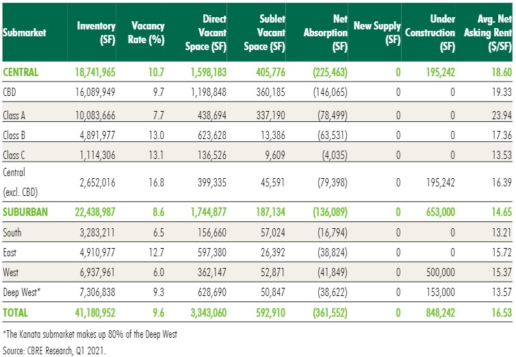
The Kanata market is referred to as the “Deep West” above, and it is the last line in the “Suburban” part of the chart just above the “Total” line at the bottom of the chart.
Some general impressions arise:
- the Ottawa market is likely close to being balanced, in that it neither favours owners nor occupants, with an overall vacancy rate of 9.6% overall.
- The “Deep West” submarket is closer to being balanced as well, with a vacancy rate of 9.3%.
- Sublet space in the “Deep West” represents 70 basis points in the 9.3% vacancy rate, while the direct with owner’s vacancy rate at 8.6%, closer still to a balanced market.
What matters to occupants:
Now compare that with the interests to occupants, as in what options are there for my firm. What is important is how many opportunities of x,xxx square feet exist that could be a good replacement for what my firm has now. Will I have pricing power as an occupant?
We have used the Altus InSite property search site to determine Kanata availabilities:
Area (sf) | Direct Options | Sublet Options | # of Providers | Total Area (sf) |
2,000 – 5,000 | 40 | 6 | 15 | 159,000 |
5,000 – 10,000 | 23 | 5 | 11 | 192,000 |
10,000 – 20,000 | 5 | 3 | 6 | 97,000 |
20,000 – 50,000 | 8 | 0 | 3 | 278,000 |
50,000 – 100,000 | 4 | 0 | 4 | 311,000 |
100,000 plus | 2 | 0 | 2 | 211,000 |
Keep in mind that what matters to occupants is how many options they have. This chart gives an entirely different view to the Kanata office submarket depending on the size of the occupant.
If the occupant is between 2,000 – 5,000 square feet, they have 46 possible options with about 15 different providers (owners or subtenants). The traditional reporting of vacancy rate suggested the market was in balance between owners and occupants. That is not the case for occupants of this size with as so many options from so many providers. These occupants seem to have pricing power in a negotiation.
For the biggest firms in Kanata, there are two choices for opportunities of at least 100,000 square feet, and only 4 choices for firms looking for 50,000 – 100,000 square feet. This lack of choice may allow for new developments to compete more effectively for any potential demand for space of more than 50,000 square feet.
The market asymmetry:
As illustrated above, the traditional reporting as seen in the example from CBRE does not really address what occupants want to know for their specific requirements. If owners did a similar analysis addressing the occupant view of the submarkets, they could modify their leasing campaigns to reflect their relative strengths/weaknesses in the pool of most likely competitors for the same occupant.
I do wonder why quarterly reports do not have a section that addresses the occupant view of supply. Do you find this asymmetry leads to market arbitrage opportunities?